In Conversation With: Naomi Kvedaras
How did you find out that The Lit Platform was looking for a visual artist?
A university tutor told us during a meeting. I thought it sounded like a good opportunity, and the theme of celebrating short attention spans motivated me to apply. I haven’t been diagnosed with ADHD, but I definitely get easily distracted! Art is something on which I can actually direct my focus and not get pulled away from it.
How did you initially approach the project for The Lit?
I read the brief then the synopsis of each article to get an idea of the key themes. I decided upon a series of works with a consistent theme rather than individual pieces that were unique to each article. The editorial team let me know the hierarchy of the articles, whether they wanted a big or small illustration for each one. Then I started figuring out my illustrations. You can’t always outline a strict timeframe for the work, each individual piece is very different. Once I’ve finished creating something, I wouldn’t say that I am always pleased with it, because I feel like I could have done better. But I guess that comes from doing something creative. I have had professional commissions before, but not an editorial job like this. I’ve definitely enjoyed challenging myself .
Could you describe your style for us?
I think it’s quite difficult for me to describe, because I’m going through a strong transitional phase. Every new piece is a playful experimentation. I think there are certain characteristics to my work. Firstly, I create a lot of contrast in each visual component. I use monochrome to get that contrast. Another characteristic is that I use very consistent line work. I want to create harmony between all of these different aspects, and something that generates an energy of uneasiness. And I want people’s eyes to linger on it, to experience a ‘moment’ with it.

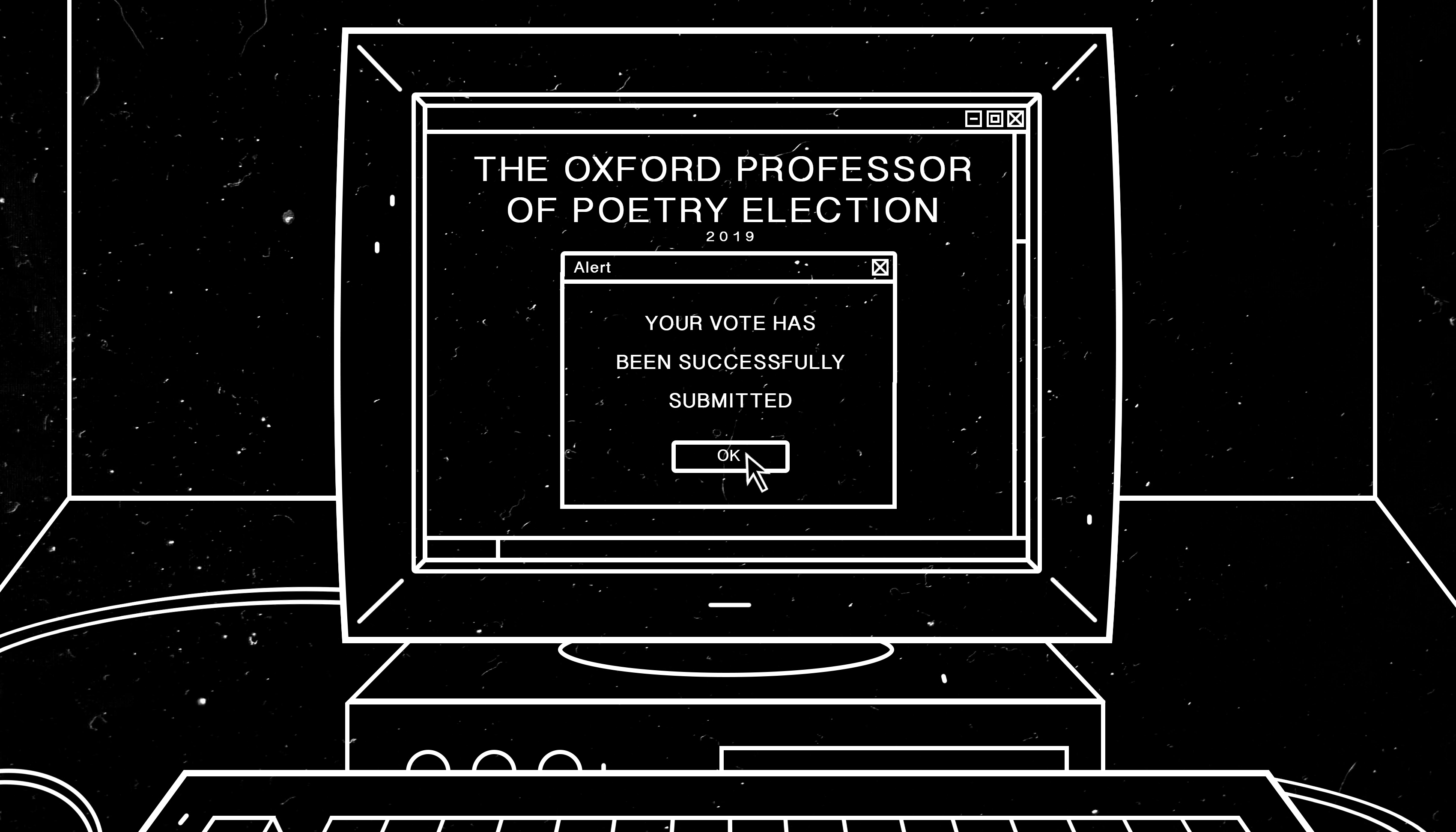
You used quite a consistent style for the illustrations you did for The Lit. Were you quite keen to design your illustrations in that vector-like style?
I had to consider the time restraints on the project. I thought it would be more reliable to use digital illustrations because I could easily adjust those, but the digital appearance also related well to the articles’ themes. I wanted to create a continuous theme within the series of illustrations where each piece relies on the visual language of the others to develop an illusion of alternate reality. My work usually incorporates contrast, and for The Lit, this contrast existed between the more graphic style of each image and its organic overlaid texture.
How do make an individual illustration?
Once I have the concept, I have to find time to be alone. I usually put on instrumental music so that I don’t get distracted by the lyrics. I warm up by doodling. Afterwards I research, gather references, and think about whether I want to include any symbolism. Then I come up with compositions, layouts, and consider what sort of perspective would be strongest. If it’s a digital image, I would go straight onto using Photoshop or Premier, and if it’s a hand-rendered piece, I sketch it out on a piece of paper with pencil, then use a lightbox and trace over it with either Indian ink or black gel pen. Then I would scan in the image and edit it further on Photoshop and other editing software. For The Lit, all the images were digital, but I did some drawings for reference at the beginning. With digital, you can sit down on your bed and spend hours on your laptop exploring the different kind of effects that you can create. It’s very easy to manipulate and edit. Whereas there’s something very meditative about sitting down with a pencil and just relaxing yourself in a way so that your hand is steady enough to draw consistent lines. Afterwards it feels like an achievement because it’s something physical that you’ve put delicacy and time into .
How did you come up with the design for the front cover of The Lit?
When trying to convey a meaning through one image, I wanted it to be captivating. I used animation because I thought it was a good opportunity to do that for the magazine as a digital platform. I arrived at the idea of creating two images in one to convey the experience of that distraction and flickering attention. Ideally, I would have done animations throughout The Lit, but unfortunately we were working to really tight deadlines. It’s about striking a balance when you consider what’s achievable given limited resources.
What influences you creatively?
As a child I used to have dreams that had a very particular energy. Then sometimes I see things that remind me of that energy, and I will try to incorporate them into my work – anything from the certain way the light is shining to particular perspectives. There’s also this sensation that time is both speeding up and slowing down, so I’m trying to recreate that kind of energy in my work. I enjoy making animations that loop seamlessly, to create that sensation of eternal repetition, to question our limitations as humans against time and space. I enjoy referencing certain items which carry symbolism yet withhold a narrative and are open to interpretation.
This issue of The Lit celebrates short attention spans. Do you think an artwork requires a viewer to spend a long time looking at it to develop an understanding and connection?
Prolonged eye contact between two individuals helps to develop a connection between them, and I feel like that’s similar to an artist creating a piece of work for their audience. That expression opens up a window, and once the artist is removed from the piece, it welcomes the observer to become intimate with that expression. Time would reveal whether there is a correspondence between the art and the observer. If there is a connection, it might be a deeply embedded subjective resonance that could only grow with time. But it depends on the individual observer’s psychology, and what fulfils them; what they’ve been through and how they connect to that piece. Not everyone is going to love everything!
+
Think you’ve got what it takes to be our visual artist for Issue Two? Then get in touch.